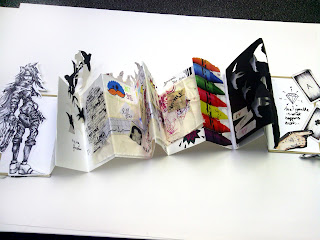

This is the final product of my concertina sketchbook..
I dressed up the cover of my book with imagery cut out from magazines from a variety of magazines, I then drew over some of the imagery. Why i did this? because anyone can cut and rip out images from a magazines heck, even format it in the same layout as the one I've managed to come up with, but the drawings was a reflection of me, I wanted to portray my personality and traits of myself on the cover, I felt I successfully did this.

This was what was on the inside of the first page of my sketchbook. It is an image of Vincent Valentine, from the Final Fantasy series. I drew him with a black OHP projector pen and cut him out in order to put him in my sketchbook. The reason as to why i chose him to be in there as well as draw him, is because Final Fantasy is a big part of my life, I like the character design, the game, animation and story line and it just so happens that Vincent Valentine is one of my favourite characters, so when drawing him I made sure I made him look like his character in my own style and made sure, to me it was perfect.

This is on the second page of the sketchbook, the page that mirrors the one above. I cut out a keyhole in the centre of the page. This was metaphorical symbolism. Look through the keyhole and you will see...
I roughly highlighted around the hole, to make it stand out, for it was the main focus of that page, the décor around it was in aid to highlight the centre. The wings resemble the phrase 'Spread your wings' by looking through the hole you'd be able to open up your mind and in a way be able to mentally spread your wings.
The illustration above is of an eye that's looking down, once again this is to abstract your mind and follow where its looking which would be the hole. The text around it however has more of a dark undertone to it, 'Lie, Lies and Tiny Eyes' this subjects that its not all peaches and cream with me.
I decided to use my own handwriting to write 'I developed a passion' I wrote this at the start of the page because, in the beginning that's what I did? I developed a passion and in reflection to the other page where you can see Vincent Valentine, your able to see what happened when i did.
The image of the fellow below that, was purely because he looked happy... and he had white hair. He looked like a very happy chappy.

Following onto the next page, through the keyhole are sparrows. I cut these birds out in black and white, in varying sizes.I used that colour scheme as the meaning of those two tones suggest light and darkness. Thus it becomes easy top see that in life you have to take the rough with the smooth, or in this case the light with the dark. Its an equal balance.
Starting off small, getting bigger and bigger as well as massing in numbers. For me, portrays my ongoing journey, throughout the duration of developing myself, My opportunities and life changing chances expanded and numerically doubled.. multiplied..! so generally speaking, they massed.
The connotations of these birds relate to the words distance, love... freedom. Below are the words, written in my own hand, 'Its my freedom'. The sparrows represent to me, my passion. I developed it, I went the distance, still going the distance, I love what I do and its my freedom, its how I express myself, its what I'm good at and it makes me happy.
The page after the sparrows is a hand written Caligram. A Caligram is getting an image and using its outline in which you are then liberated to fill in the interior with text. The majority of my colleagues used Adobe Illustrator to do this, however I didn't want my Caligram to be computer generated therefore I did it without it. Using tracing paper, I cut out an outline of my head (with my hair tied up) and inside filled in the spaces with words that had great significance to me. They are words that make me who I am and what I have become.
The decision to use tracing paper was simple, I wanted whoever was looking at it to see the page behind of it.
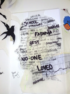
The page behind it is my timeline. The start of it, I should add.

This is the start of my timeline.

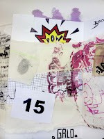
I wanted to induce more colour to the middle section of my sketchbook, because to me like a donut, the good stuff is in the middle! As well as that the ulterior meaning for the colour being in the middle was a subconscious relation to myself. The creativity within myself doesn't necessarily come from my mind, but it comes from the centre of me. So I dressed it up, but made sure the colours and imagery were not overpowering because the
central focus of this page was the timeline.
Seeing as the timeline was to express the past, present and future on a heart monitor-type lifeline, I added motivational quotes and things that were related to me all around the pages, in which has taken me from the past, into the present and will help me along the way in the future.
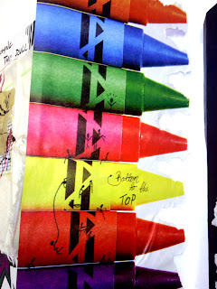
Moving on from the timeline page, I included a page which shows a range of crayons.
I saw these crayons in a magazine. I liked the colours of them and after a while of just looking at them for the duration of two minutes, they started to look like a sort of ladder, in which to me gave me a winning idea of drawing small stick men on the crayons doing a variety of different things in order to get to the top.
The perception of this was to show you what I have done and still doing to get to the top, the stick men trying a number of different ways to move themselves up the crayon ladder denotes the creativity in which I muster to think outside the box in order to heighten my chances and prosperity to moving upwards and onwards.

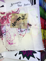
The black card I used to cut out my sparrows was then used as my next page. From after cutting out the sparrows previously I knew I wanted to use it, as it came across to me as, using the past to help in your future.
I wanted the sparrows to look as if they were flying the left (which is towards the beginning of the book) Because, seeing as i used this piece of card to cut out my sparrows, it then became a stencil, so a piece of art within itself, therefore by using it for a previous page (representing the past) it also helped me in my future page, and by having the sparrows looking like they are flying towards the front of the book, it mean't I could artistically prove the meaning of using your past to help with the future.
I applied masking tape in a jaunty way on the bottom of the stencil and wrote in colour 'Don't Regret, Just Go For It' because that is one of the mantras I use in my life and work to push myself into new things and experiment, because you never know unless you try.
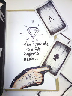
For my final page I wanted to end with on a simplistic note.
The reason as to why I wanted to do this was as simple as the page. Due to the fact that it was to symbolise my future, I didn't want to over throw it with various imagery that had a specific meanings to what my intentions were -in regards to my job, relationships, status etc- because I know my ambitions and overall status is constantly changing.
Bearing that in mind I was able to generate an idea. Draw a diamond in centre page and use it as a compass. A diamond in which signifies riches and success, for me these riches and successions could be for anything, it could be for a job, love, life etc, therefore it's not specifically aimed at anything in particular.
The comment under it 'The gamble is what happens next...' tells you that anything could happen, of course depending on the roads you choose, paths you take and choices you inevitably have to make is nothing but a gamble. The hand below it points to the cards littered on the side of the book, this is to make it apparent as to what its pointing to. The cards. The gamble. The next page. The future.
 When drawing the shell, on a large scale, I had to take my time and draw the outline first, because once the outline is complete I can work on the rest of the details. Drawing the shape of the shell was simple, because I maintained reference to the actual shell. It helped me get each part of the shell drawn in proportion and in the right place.
 After getting the shape drawn, I was then able to start work on the detail. Thanks to outline this was easy for me to do, seeing as I just needed to get the right shades, shapes and tones in the right place.
 After getting the detail drawn in, it was then complete. I am very pleased with the outcome, because the drawing looks exactly like the object I was drawing it from.
 Starting on another shell, applying the same technique I used on the initial one, I outlined the shape of the shell and began to shade/tone and detail the interior of the drawn shape.


